La Cantine

French Bistro Restaurant Concept

Details

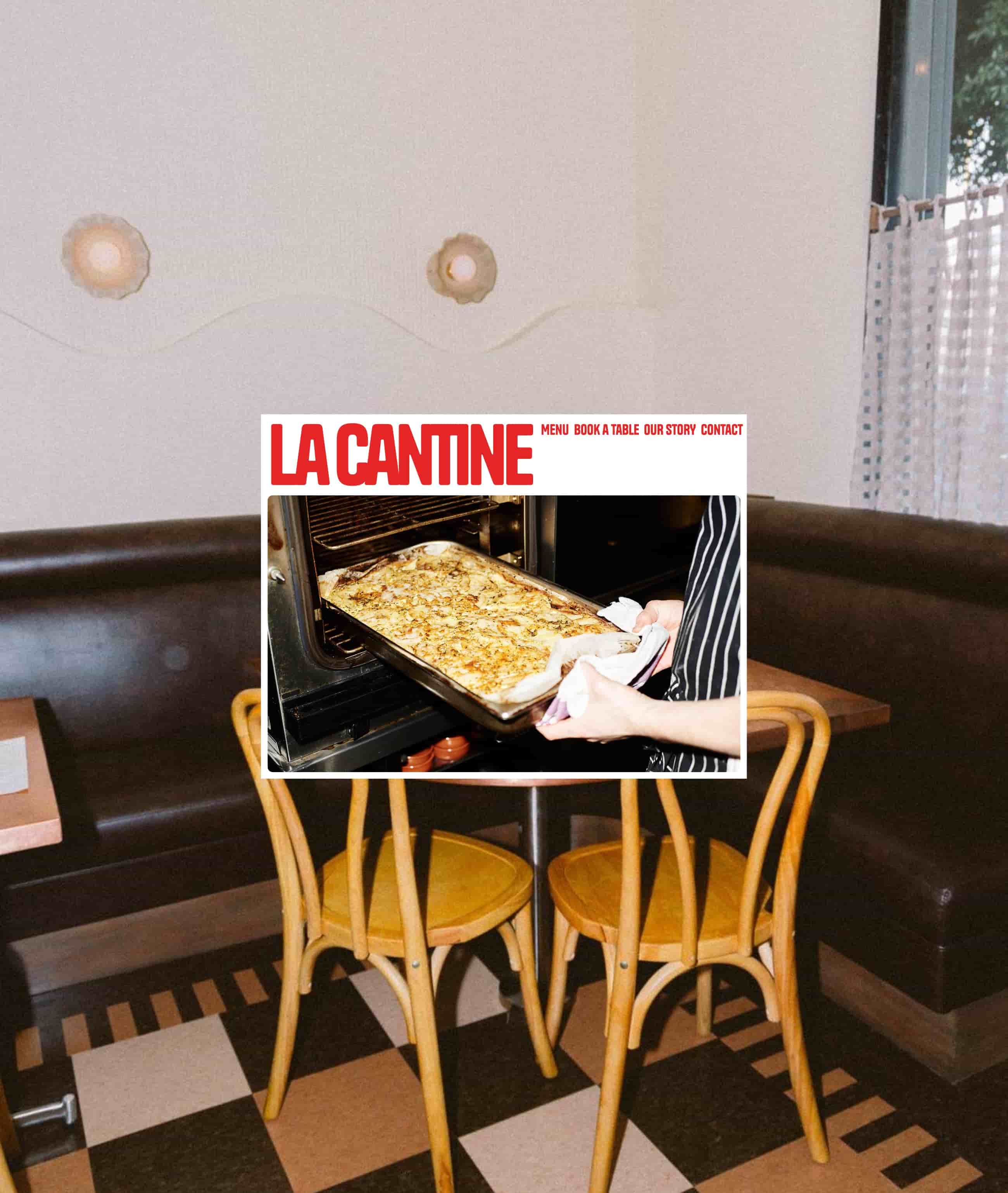
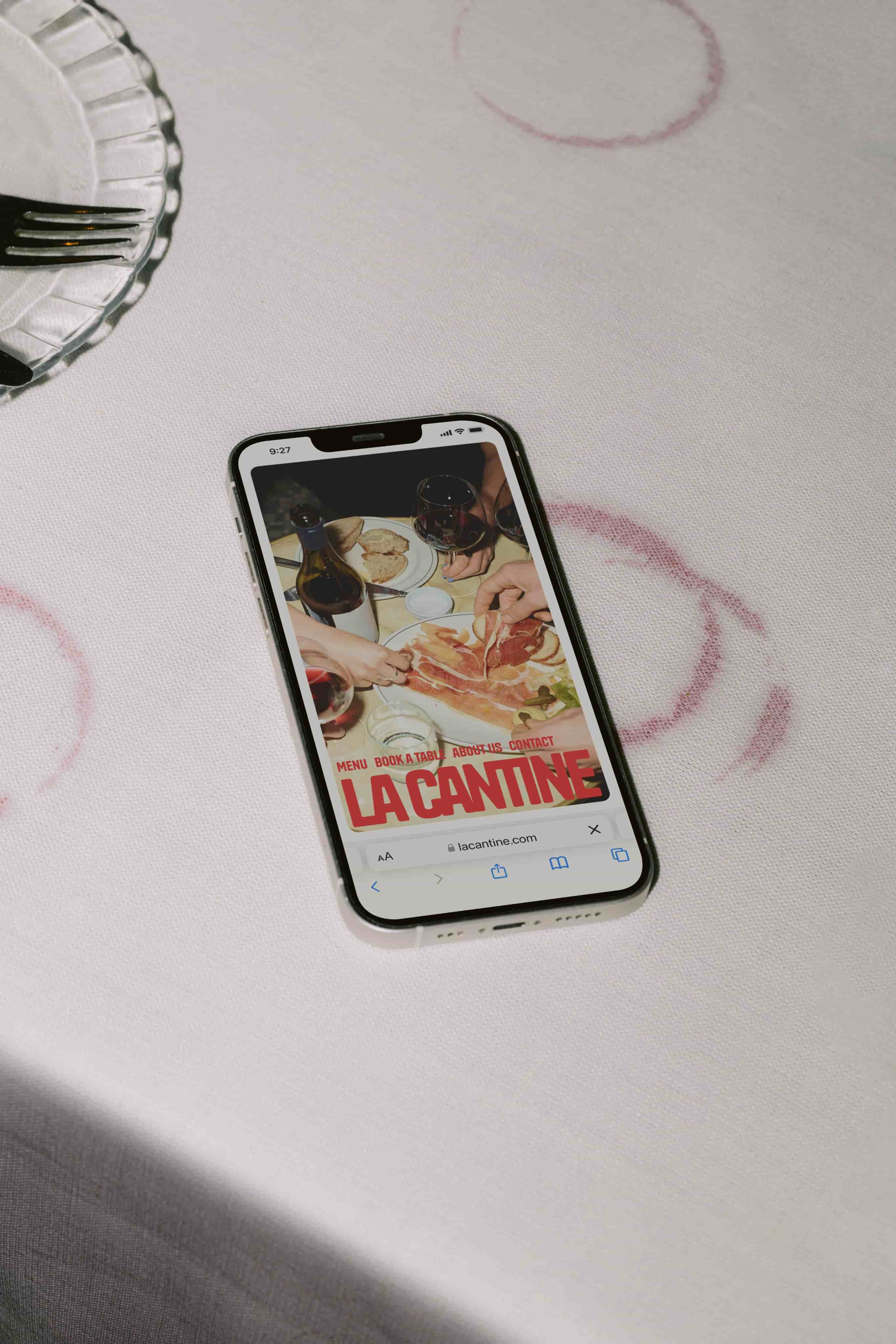
A modern visual brand identity for a conceptual French Bistro. La Cantine inspired by minimalist Parisian aesthetics, the identity blends contemporary typography with warm inviting colors, evoking the charm of a neighborhood bistro. This was a collaboration with my fellow Hyper Island student Amanda Castagna Palen.

Services

Digital Design

Brand Identity

Year

2024

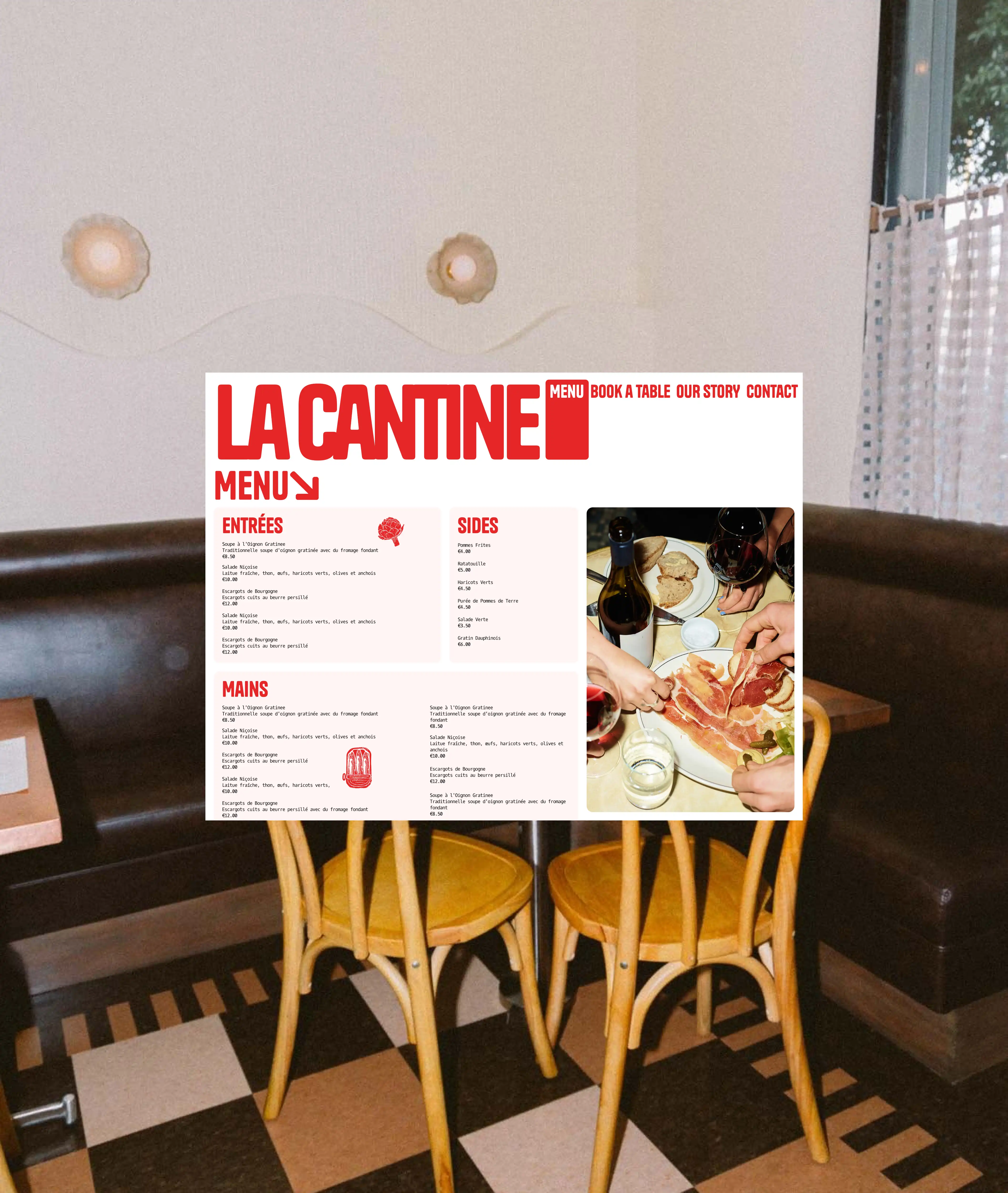
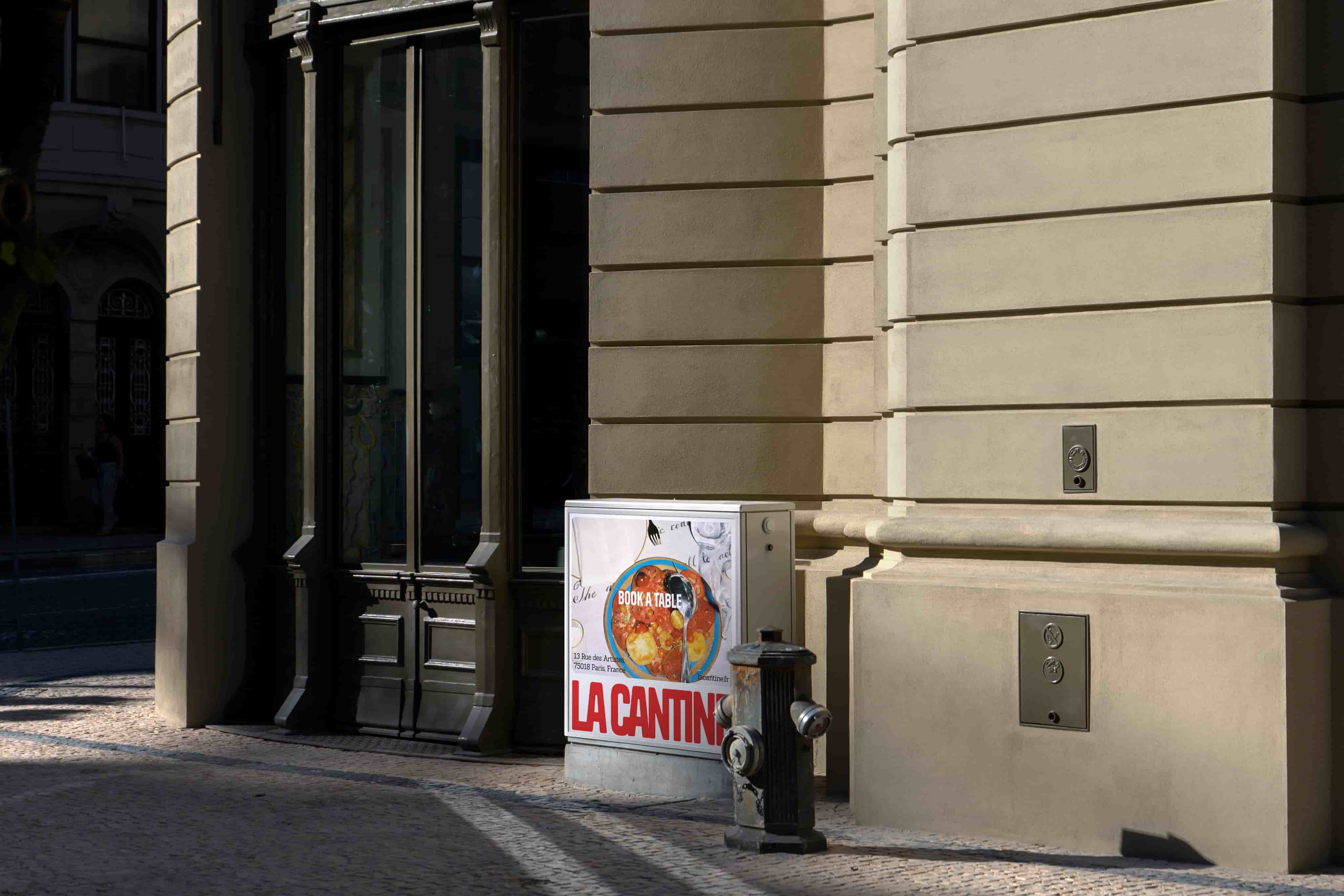
The design balances tradition with modernity, combining clean lines and playful elements for a chic yet approachable visual experience, reflected across all touchpoints.

Collaborating with an talented illustrator allowed me to focus on composition and making sure that the feel of the restaurant could be experienced throughout the customers experience.

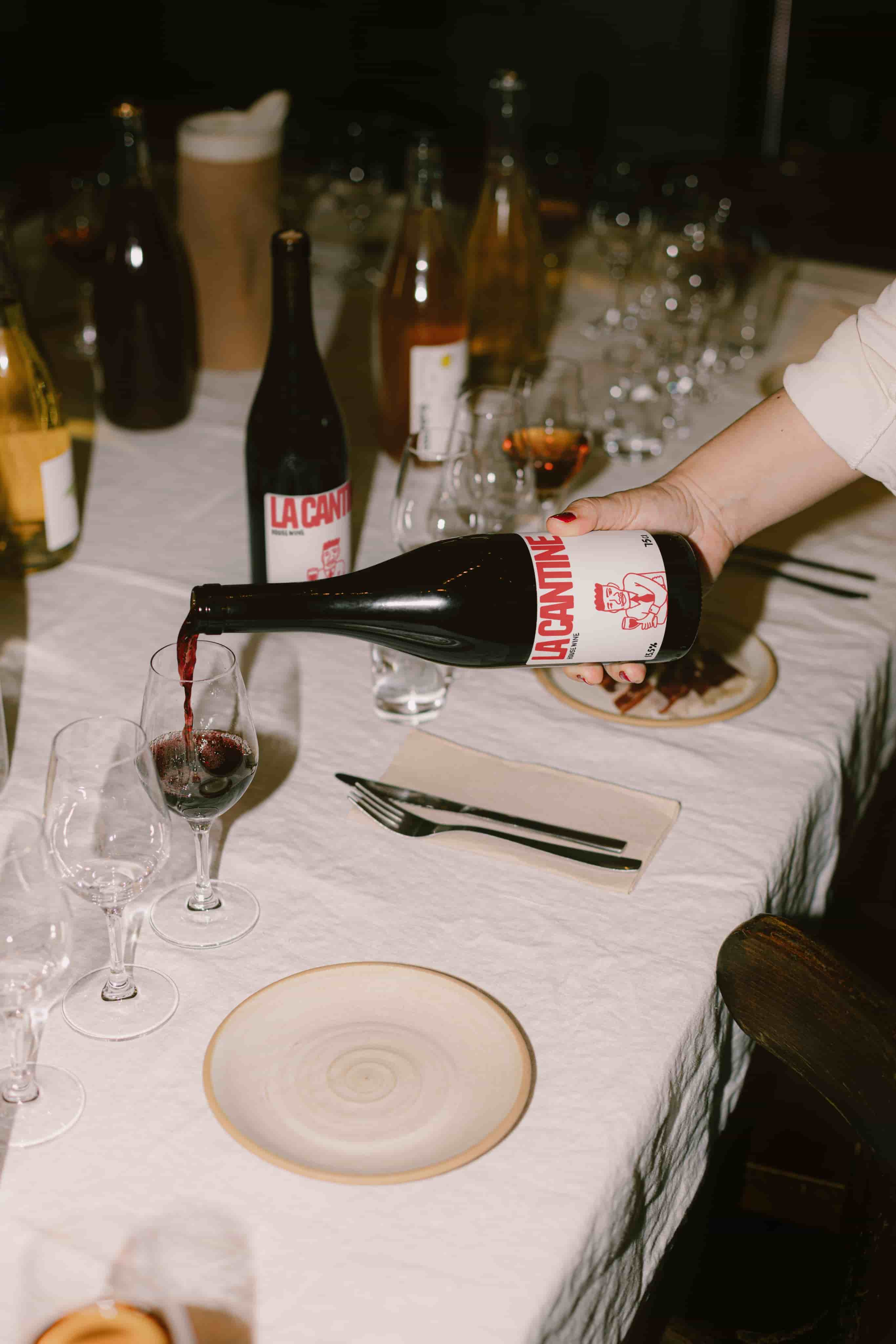
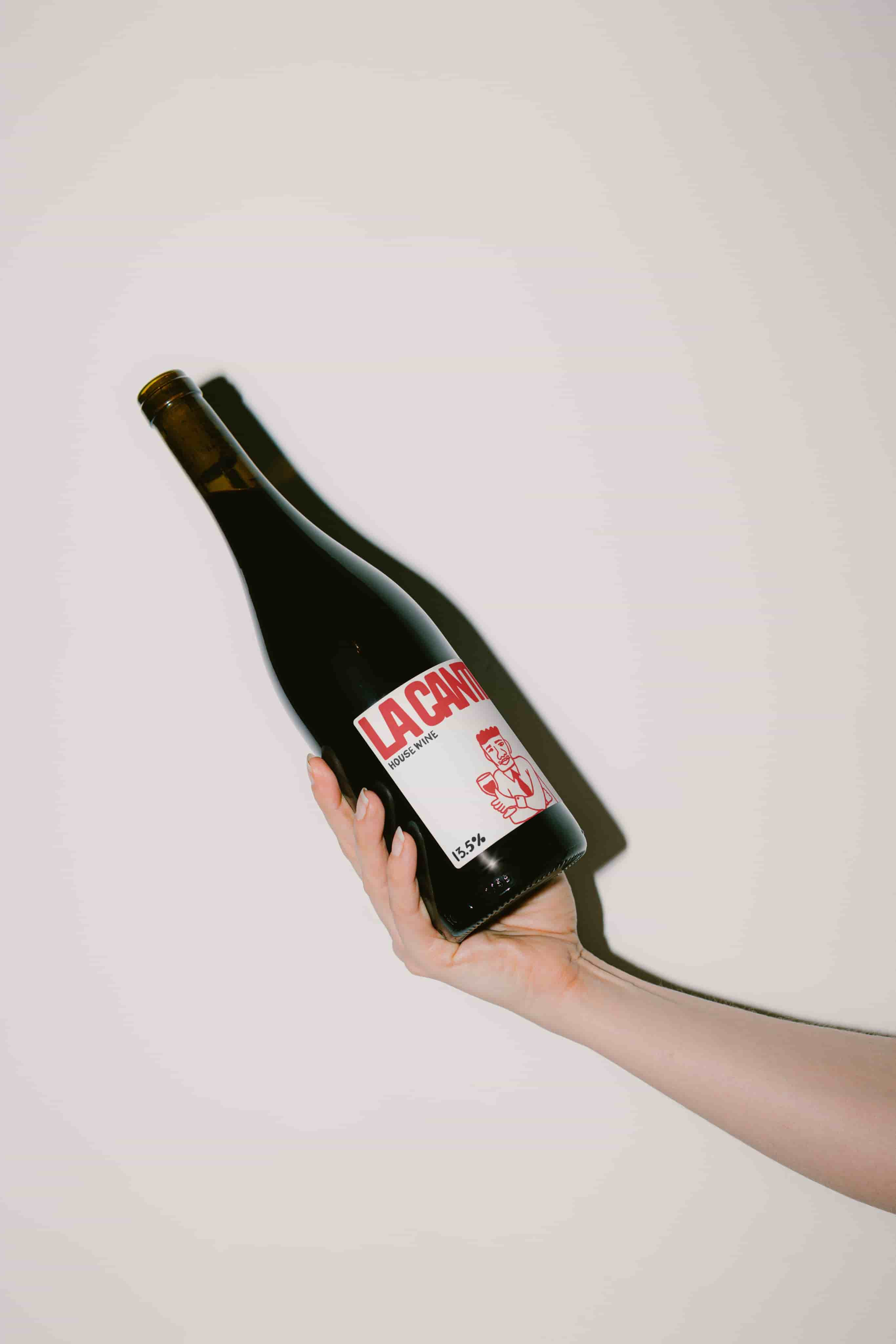
We designed the La Cantine House Wine label to capture the casual, approachable essence of a neighborhood bistro. The bold typography and playful illustration evoke a sense of community and comfort, inviting guests to enjoy a glass without pretension.


The minimalist yet charming aesthetic reflects the authenticity of La Cantine’s brand, with the hand-drawn character symbolizing the joy of simple pleasures shared over good food and drink. It’s a visual embodiment of a place where wine is as much about the people you share it with as the flavor in the glass

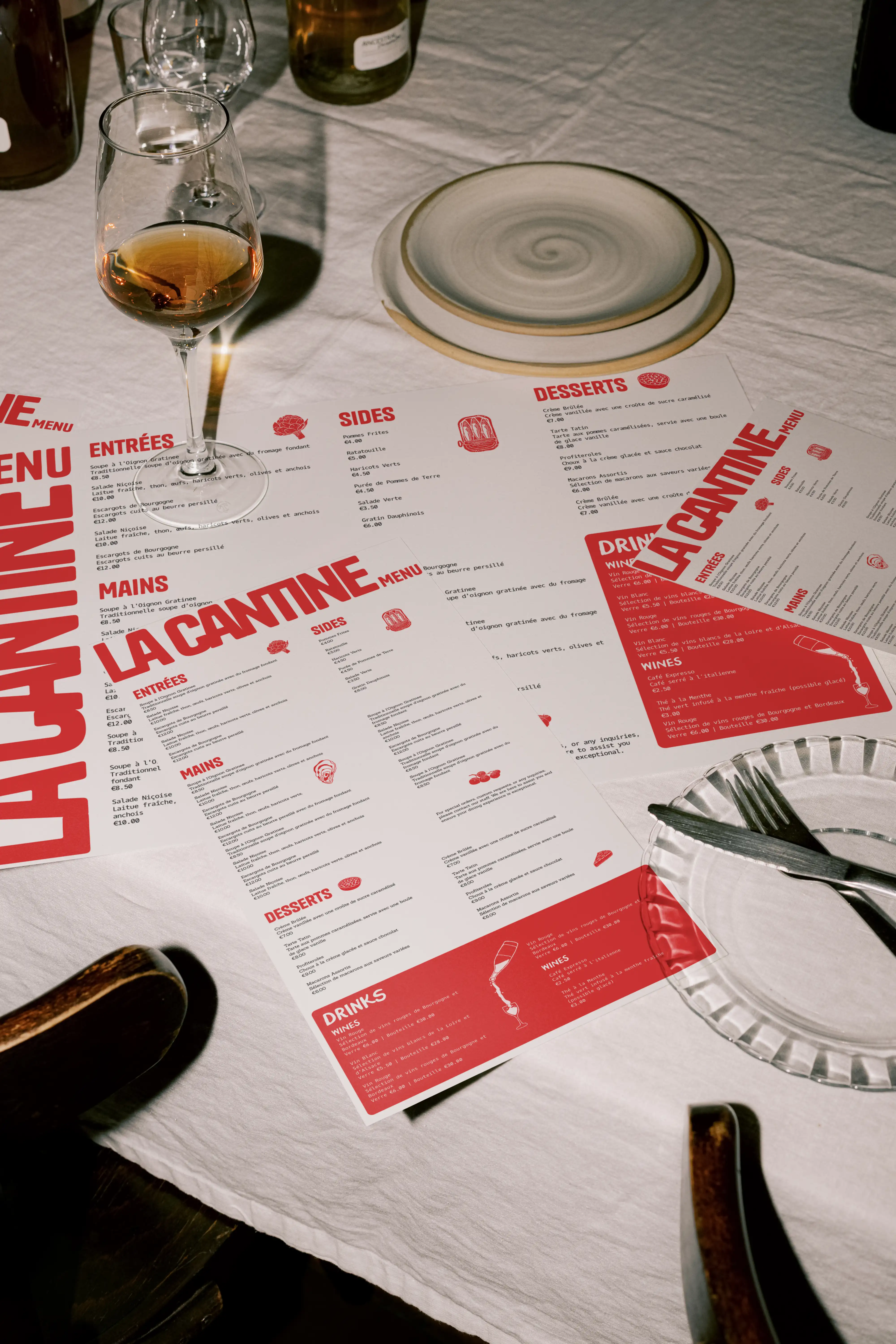
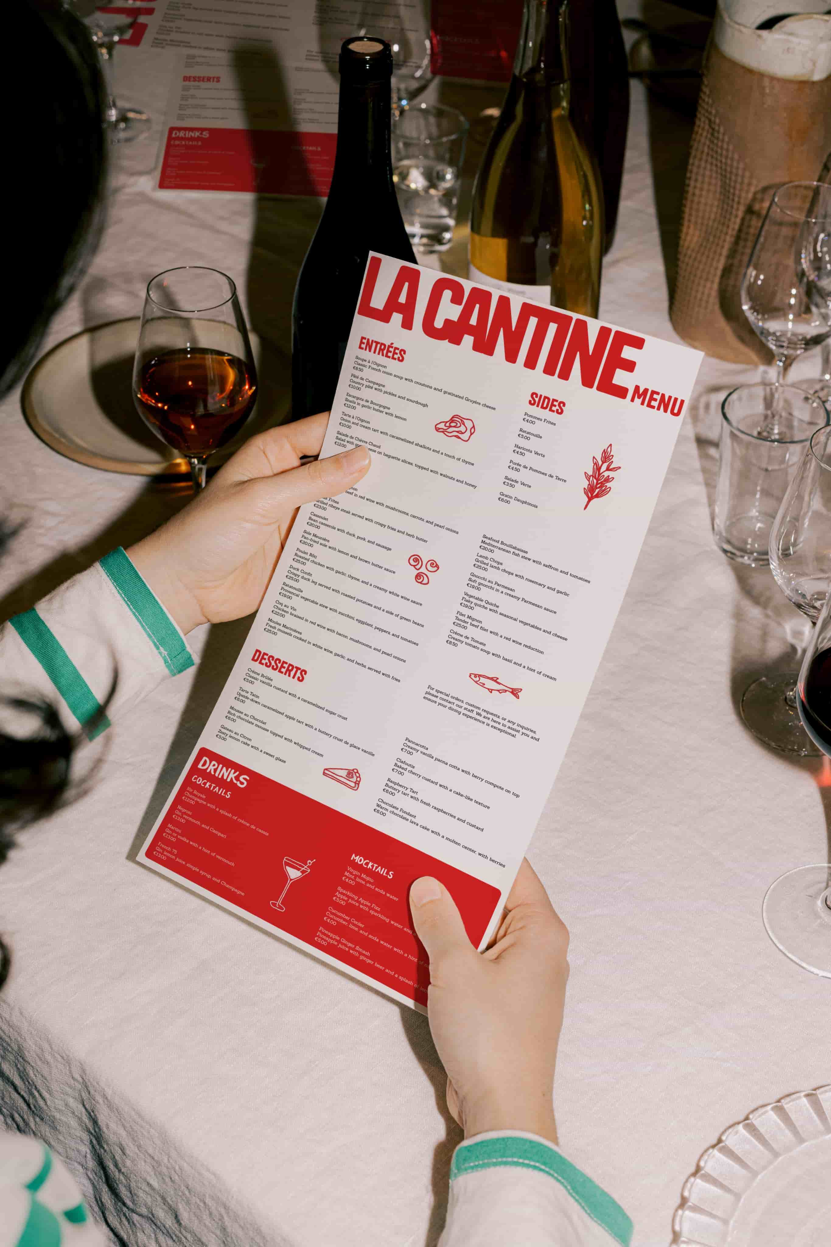
The La Cantine menu design is a clean and modern reflection of the bistro’s identity. Bold red typography contrasts with the white background, creating a striking yet approachable look. Playful illustrations add character, while balancing simplicity with personality.


One of the key challenges was ensuring that all the information fit seamlessly across two formats while maintaining visual harmony and readability. Through careful layout choices, we achieved a cohesive design that’s both easy to navigate and effortlessly chic.

Credits

Creative Direction

Amir Hamidi
Amanda Castagna Palen

Illustration

Amanda Castagna Palen

Design

Amir Hamidi